.gif)
One of the more interesting examinations is Joe Hallock’s work on “Colour Assignment.” Hallock’s data showcases some clear preferences in certain colors across gender. The most notable points in his images are the supremacy of blue across both genders and the disparity between groups on purple.
It’s important to note that one’s environment – and especially cultural perception – plays a strong role in dictating color appropriateness for gender, which in turn can influence individual choices. Consider, for instance, this coverage by Smithsonian magazine, detailing how blue and pink became associated with boys and girls respectively, and how it used to be the reverse.
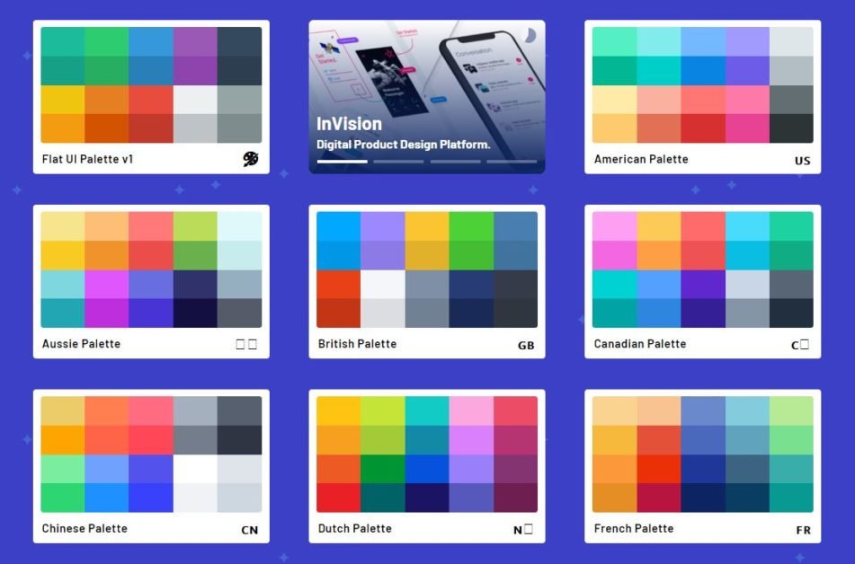
Here were Hallock’s findings (attached pictures)
Additional research in studies on color perception and color preferences show that when it comes to shades, tints, and hues, men generally prefer bold colors while women prefer softer colors. Also, men were more likely to select shades of colors as their favorites (colors with black added), whereas women are more receptive to tints of colors (colors with white added).
Although this is a hotly debated issue in color theory. Brands can easily work outside of gender stereotypes – in fact, We’d argue many have been rewarded for doing because they break expectations. “Perceived appropriateness” shouldn’t be so rigid as to assume a brand or product can’t succeed because the colors don’t match surveyed tastes.
We understand you better, we can give you the right taste.